Saturday 30 November 2013
Wednesday 27 November 2013
Film Review: The Shining
The Shining (1980) 119min

(Fig 1: An 'The Shining' Poster)

The Shining, directed by Stanley Kubrick in 1980 is another physiological horror witnessing the slow insanity of a caretakers mind. The story begins with a man named Jack being interviewed by Overlook Hotels Manager after applying for Winter caretaker. He is offered and accepts the job and soon arrives with his wife Wendy and his son, Danny; also known as 'Doc'. Soon after arriving the family are snowed in after a storm hits, thus being left alone kept from society, thus resulting in the outrageous occurrences throughout the film. As Dustin Putman says in his review; ''A deliberately paced, but endlessly creepy, horrifying motion picture.'' (D. Purman, 2013) Although the film is not bout the eeriness of a haunted apartment, but whats going on within it.
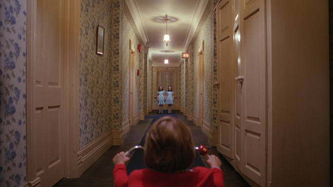
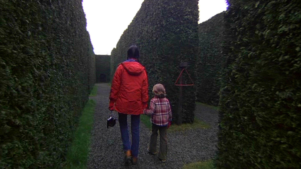

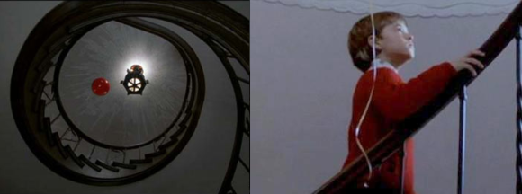
(Figures 2 - 4: The Colour Red Featured Throughout the Shining)
The musicality of the film is also very aggregating to most audiences, dramatizing every move that the characters make. As Eric Henderson states in his review; ''It's the surround experience more so than the actual content of The Shining that radiates cold, anti-humanly indifferent terror.'' (E. Henderson, s.d) This type of atmosphere keeps you biting your nails from start to finish, which is not so common in the 21st century horror films.
The colours featured in The Shining are very off putting. The bright orange and brown 70's carpet clashing with shiny, reflective walls to some viewers can be very sickly. But apart from the obvious streaks of colour, there is also a sense of meaning behind them. Whenever something appears to be happening or is going to, for example when Doc see's two undead girls at the end of a hallway, he is wearing the colour red. This is repeated several times during the film, specifically around the two main characters who appear to have the 'gift' known as the 'shining'.
The colours featured in The Shining are very off putting. The bright orange and brown 70's carpet clashing with shiny, reflective walls to some viewers can be very sickly. But apart from the obvious streaks of colour, there is also a sense of meaning behind them. Whenever something appears to be happening or is going to, for example when Doc see's two undead girls at the end of a hallway, he is wearing the colour red. This is repeated several times during the film, specifically around the two main characters who appear to have the 'gift' known as the 'shining'.
(Figure 5: Sixth Sense - Coal Sear's Jumper and The Red Balloon)
As seen in the 1999 film, the Sixth Sense, directed by M. Night Shyamalan, the colour red is also used as another indication of something 'bad' about to happen. This is a much more cared and thought about process that can also subconsciously trigger in your mind whenever this colour appears, despite the lack of music or obvious danger. The Sixth Sense is also very similar to the Shining by the explanation of another 'sense' used by a young boy. The thoughts that young children have appear to be very naive and genuine, which accumulates to uneasy feeling people get when I child speaks about things, just like Danny and Coal.
To conclude, The Shining is a must see film for any horror/thriller goers, enlightened by the big screen. As Alistair Harkness says in his review; ''Kubrick's compositions and Jack Nicholson going kill-crazy with an axe remain hard to beat on the big screen.'' (A. Harkness, s.d) The one point perspectives create the feeling of strangeness from start to finish, and is one of the many great, raw horrors of the century.
Bibliography:
A. Harkness. (s.d) The Shinning Film Review (Accessed on 27.11.2013)
URL At: http://www.scotsman.com/what-s-on/film/film-reviews-the-shining-keep-the-lights-on-fun-size-5-broken-cameras-silent-hill-revelation-1-2609152
D. Putman. (2013) The Shining Film Review (Accessed on 27.11.2013)
A. Harkness. (s.d) The Shinning Film Review (Accessed on 27.11.2013)
URL At: http://www.scotsman.com/what-s-on/film/film-reviews-the-shining-keep-the-lights-on-fun-size-5-broken-cameras-silent-hill-revelation-1-2609152
D. Putman. (2013) The Shining Film Review (Accessed on 27.11.2013)
E. Henderson. (s.d) The Shining Film Review (Accessed on 27.11.2013)
Illustration List:
Fig. 1. The Shining Poster (1980) From: The Shining Directed by: Stanley Kubrick [Poster] United Kingdom, United States. Warner Bros. URL At:
http://www.matthewmiles.co.uk/2011/06/05/the-shining-movie-poster/ (Accessed on 27.11.2013)
http://www.matthewmiles.co.uk/2011/06/05/the-shining-movie-poster/ (Accessed on 27.11.2013)
Fig. 2 - 4. The Colour Red Featured Throughout the Shining (1980) From: The Shining Directed by: Stanley Kubrick [Film Still(s)] United Kingdom, United States. Warner Bros. URLs At: (Accessed on 27.11.2013)
Wendy's Coat in the Maze: http://thelionthewitchandthewardrobemalfunctioned.wordpress.com/2012/09/11/the-shining/
Fig 5: Sixth Sense - Coal Sear's Jumper and The Red Balloon (1999) From: The Sixth Sense Directed by: M. Night Shyamalan [Film Still] United Sates. Hollywood Pictures. URL At:
http://screenmuse.wordpress.com/2012/11/03/colour-symbolism-red-in-the-sixth-sense/ (Accessed on 27.11.2013)
Secret Lairs: Basic Lair Orthogrphic
Basic Lair Orthographic
To understand the 'space' within my scene I have created a very basic orthographic views (Left side, Top view) of my secret lair. This is just the stage before complexity starts within Maya.

I want this to make sense however still look very well presented Over the rest of the week I will be designing the 'props' within the lair more accurately and more importantly visually.
Secret Lairs: Staircase Orthographic
Staircase(s) Orthographic
As my scene evolves 2 stairs, upper and lower, I needed to just quickly plan how they would look like from the top and side viewing point.

As my lair in going to many be black and white I have created them with the colour variations of the two.
CG Artist: Finished Zoetrope
Zoetrope Animation
Here are some pictures of my final Zoetrope animation within a Zoetrope created by hand and coloured by water colour pencils.


I wanted to create a very natural and cheerful animation embracing the childlike approach to create a boldly coloured 'Rainbow Wave'.
CG Artist: (27/11/2013) Life Drawing
Facial Features, Hands & Feet
During this mornings life drawing class, we were asked to primarily focus on the models head, hands and feet. This was due to the lack of practice expressed in previous classes.


I really went out of my comfort zone when creating this particular piece. The models facial features fascinated me the most and could draw from easily, however his hands and feet were slightly out of view. But I tried to practice them anyway. The last two images are part of a quick 1 minute pose to get us warmed up.
Tuesday 26 November 2013
Secret Lairs: Runic Archway Orthographic
Runic Chamber Orthographic Views
Within my secret lair, I have two rune-ish archways supporting the stairway seen in my concept art, so to help me build them I have created very basic orthographic views to help model them in Maya.

As my lair in going to many be black and white I have created them with the colour variations of the two.
Monday 25 November 2013
Secret Lairs: Lair Concept - Colour Changes
New Secret Lair Concept
Colour Changes
Colour Changes
From looking at the reference from my OGR Feedback, I have changed my final concept to replicate a similar style to create better and more dramatic atmosphere.

I overlaid the first layer after converting the original to a black and white image. This is where I used a large gradient brush to highlight key areas around my hero prop.
Secret Lairs: OGR (2) Response @ Style
Black & White
With Colour Contrast!
With Colour Contrast!
From my OGR, Phil recommend I take my scene and make it completely out of reality into a more stylist approach. Such as a 'Lino Cut' art based concept.


I really love this idea of having a strong black and white based image, with my hero prop (Soul Stone) being the high contrasted colour emerging from the rest of the scene.
Secret Lairs: Hero Prop Orthographic Views
Hero Prop Orthographic Views
This is my very first attempt at any Orthographic views. I wanted my working/developmental ideas to be as colourful and as striking as possible. To be visually appealing.

I found the top viewing point hardest to recreate as I struggled with knowing 'which point is which?' etc.
Friday 22 November 2013
Film Review: REPULSION
REPULSION (1965) 105min

(Figure 1: REPULSION Poster)
REPULSION, directed by Roman Polanski in 1965 is a film designed and created to make any audience feel uncomfortable within their own skin. The story unfolds around a young girl known as Carol, who clearly suffers severely from social interactions with men and thoughts evolving around them. As said by 'TV Guides' movie review; ''One of the most frightening and disturbing pictures ever made.'' (TV Guide, s.d) is certainly more graphic to modern day viewers. Many believe the coarse of such heavy weighted sadness is due to past encounters, perhaps to do with abusive tenancies from her Farther, however we never truly find out.


(Figure 2 & 3: Sexual References within REPULSION)
Throughout the film, there are many sexual references appearing when you least expect them to be. As Ian McKay says within his film review; '''A potent cocktail of sexual repression, madness and violence[...]'' (I. McKay, 2006) The cinematography works perfectly when creating a huge visual image to the audience to induce personal representation from Carols eyes. As seen in Figure 3, a shadow lingers over Carol; however the shadow itself appears to be an erected penis suspended over her. With that said, there are many other stronger references, as Figure 2 represents, therefore bringing out the subconscious reactions of sexual behaviors.

(Figure 5: Carol 'Preparing' for her Dream)
One the last nightmarish scenes is when we see Carol, 'preparing' for her Rapist she expects to be visited by during the night. It is thought she is awaiting and wanting such a thing to happen to her this time, despite earlier on in the film. The lipstick itself shows her preparing yet a slight sense of vanity, in which is not present before. At this point the audience is experiencing Carol at her most ill minded state, to where we fully understand her conscious and subconscious merging together in one full reaction.
To conclude, REPULSION is one of the most famous films to invade and protrude the mind of the viewer. As 'TIME' Magazine states in their review; ''At second glance, or as often as a moviegoer can bear to peek through his knotted fingers, it is a Gothic horror story, a classic chiller of the Psycho school and approximately twice as persuasive.'' (TIME Magazine, s.d) is how any modern auidences experience this film; as something that some may relate and feel attatched too. However viewing such destruction of the Human psyche can leave its own mark upon every individual, embracing every aspect and desire by all.
Bibliography:
URL: http://www.tvguide.com/detail/movie.aspx?id=17974&sourcetype=M
I. McKay. (2006) REPULSION Film Review (Accessed 22.11.2013)
URL: http://www.smh.com.au/news/dvd-reviews/repulsion/2006/04/17/1145126040949.html
TIME Magazine. (s.d) REPULSION Film Review (Accessed 22.11.2013)
Illustration List:
Fig. 1. REPULSION Poster (1965) From: REPULSION Directed by: Roman Polanski [Poster] United Kingdom. Compton Films. URL At: http://fruitlet.steelbananas.com/repulsion (Accessed on 22.11.2013)
Fig. 4. Carol 'Preparing' for her Dream (1965) From: REPULSION Directed by: Roman Polanski [Film Still] United Kingdom. Compton Films. URL At: http://www.youtube.com/watch?v=SX3px05fFu8 [1:28:19] (Accessed on 22.11.2013)
------
@JACKIE
I'm not sure how to reference 'time' when directed to YouTube, or any other video sources. I have tried looking on the UCA's Harvard Referencing Site but was unable to locate the information. Figures 2 - 4 are screenshots from the link.
Practising Final Zoetrope Morph
Practicing Movement
Here is my test run of my Zoetrope animation edited and put together in Dragon.
This will be my final Zoetrope animation presented at the crit next Friday. I plan to be creating everything by hand and expressing its use of colour using water based paints and inks.
Wednesday 20 November 2013
Secret Lairs: OGR (2)
Secret Lairs: Development & Final Lair Concept
Final Lair & Development
Hyperborean Demon
Hyperborean Demon
This was my build up to my final lair concept for my Hyperborean Demon. I wanted to create a very dramatic scene with eye catching colours and perspective.


I created my final using Hue/Saturation, Overlay/etc layers and adjusting the Vibrancy.
CG Artist: (20/11/13) Life Drawing
Colour Studies/ Experimenting
During this mornings Life Drawing class, I experimented with colour in terms of using colour to form recognizable figures with tone and shading.


One of our tasks was to experiment quickly with colour doing various 2, 1 and 30 second poses. The top four are 2 minute, the next two are 1 minute an the last three are 30 seconds. The second image is my experimental half hour painting trying something completely different to what I have done before. I liked the lines creating the tones and shading rather than 'dib' and 'dabbing'.
Tuesday 19 November 2013
Film Review: Black Narcissus
Black Narcissus (1947) 100min

(Figure 1: Back Narcissus Poster)
Black Narcissus, (1947) directed by the British writer/producer directors Michael Powell and Emeric Pressburger, is a story based on a psychological drama of emotional tensions within a convent of nuns in the Himalayas surrounded by a vibrant Indian culture. As Michael Mirasol says in his review; ''He depicts the nuns' mountain enclave as an ashen and distant; colorless as the sisterhood's singular devotion to their vocation. The local Indian populace is back dropped with vibrant color, looking more natural and lively.'' (M. Mirasol, 2010) This soon becomes visible within the convent with displays of dark reds and misty blues and purples.


(Figures 2 & 3: Bell Tower and Assassins Creed II)
Modern day viewers may also to pick up on features throughout many scenes that lead to resources that might not have been recognized until after watching the film itself. When Sister Clodagh looks down over the cliff face ready to begin the bell ringing, there is a very modern interpretation to this particular scene setup. From comparing the two images above, you can see a clear similarity between the typical 'Assassins' outfit from the ''Assassins Creed" franchise and Sister Clodagh's religious white gown. White is very symbolic in terms of purtity and perfection; this lies against the stages of Sister Ruths mental state of heightened sexual emotion.


(Figures 4 & 5: Sister Ruth)
As figure 3 shows of Sister Ruth gazing some what menacingly, the audience get a true understand of her thoughts and emotions just by the colours light around her. As the next quote by Dave Kehr says; ''A story of damaged faith and rising sexual hysteria..'' (D. Kehr, s.d) Dark reds and oranges and misty grey's are all of which give an uneasy, sickly appearance to Ruth becoming seduced by her love for Mr. Dean; however eventually succumbing to her madness she strips herself entirely of her 'purity' and applies the highly metaphorical red lipstick expressing her vanity.
One of the very last scenes where the full anamosity bvetween sister ruth and sister Clodagh is when sister ruth becomes the modern day 'person in black' sinister stalker. Her movements appear animal like as she scurries along the floors and up thr stairway. This dramatises her character by not only her harsh movemenets but her very own miusicality. As Keith Uhlich says in his review; "There's something truly unearthly about this place of howling winds, yawning chasms and atmosphere thick with temptation." (K. Uhlich, 2012) is what most modern viewers with preconceived with. The film itself to some viewers is very slow to get into at first, however the futhermore the characters become changed by their surroundings, the real tension begins to flow among the storyline.
Bibliography
D. Kehr (s.d) Black Narcissus Film Review (Accessed on 19.11.2013)
M. Mirasol (2010) Black Narcissus Film Review (Accessed on 19.11.2013)
K. Uhlich (2012) Black Narcissus Film Review (Accessed on 19.11.2013)
Illustration List
Fig. 1. Black Narcissus Poster (1947) From: Black Narcisuss Directed by: Michael Powell and Emeric Pressburger. [Poster] United Kingdom. General Film Distributors.
URL: http://laurasmiscmusings.blogspot.co.uk/2012/11/tonights-movie-black-narcissus-1947.html (Accessed on 19.11.2013)
URL: http://laurasmiscmusings.blogspot.co.uk/2012/11/tonights-movie-black-narcissus-1947.html (Accessed on 19.11.2013)
Fig. 2. Bell Tower (1947) From: Black Narcisuss Directed by: Michael Powell and Emeric Pressburger. [Film Still] United Kingdom. General Film Distributors.
URL: http://www.yam-mag.com/wp-content/uploads/2012/04/tcmff_black_narcissus.jpg (Accessed on 19.11.2013)
Fig. 3. Assassons Creed II (2009) From: Assassins Creed Franchise Directed by: Patrice Désilets [Video Game Still] Ubisoft. URL: http://8bitplayground.com/2011/11/08/new-assassins-creed-coming-in-2012/ (Accessed on 19.11.2013)
Fig. 4. Sister Ruth (1947) From: Black Narcisuss Directed by: Michael Powell and Emeric Pressburger. [Film Still] United Kingdom. General Film Distributors.
Fig. 5. Sister Ruth (1947) From: Black Narcisuss Directed by: Michael Powell and Emeric Pressburger. [Film Still] United Kingdom. General Film Distributors.
Secret Lairs: Development // Secret Lair
Picking Out The Detail
As I created the basic layout shapes using mark making on the thumbnail page before, I now have began to draw over my favorite design in many ways to see whether there is a potential lair within them.


I can see an archway in the marks that have lead to the idea of this 'Secret Lair' being a hidden chamber of some kind; undiscovered for thousands of years. This is still a working progress and after today's film I will start creating colour thumbnails with more development.
Monday 18 November 2013
Secret Lairs: Development // Lair Mark Making
Practicing Photoshop
Currently working with Photoshop, I find creating a digital thumbnail difficults in terms of perspective and recognisable scenery in realistic terms. Jordan recommended I push what he feels I am most strongest at; which is creating ideas from within the marks I make on a page. So, I have created a page of very basic, rough marks on a canvas to work on top of and push the ones I think I could see a potential scene from.

My favourites so far are;
146, 149, 150, 155 & 157


These thumbnails I did while in between of looking at my influence maps and other concepts.I can definitely see a difference and how I can open up the world for my character so much just from using my mind to create ideas from within the marks.
Secret Lairs: Further Development // Hero Prop
Colour Comparing
Completing my hero prop concept art has given me a broader approach to colour, therefore I would really appreciate any feedback about which colour is / would be the better choice of the 9.


My favorites are;
Dark Red/Pink, Turquoise/Blue, Bright Yellow and Lime Green/Yellow.
Subscribe to:
Posts (Atom)